Layered Cakerie
Visual Identity and Naming for a Gourmet Cake Startup
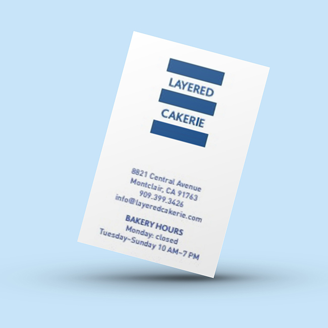
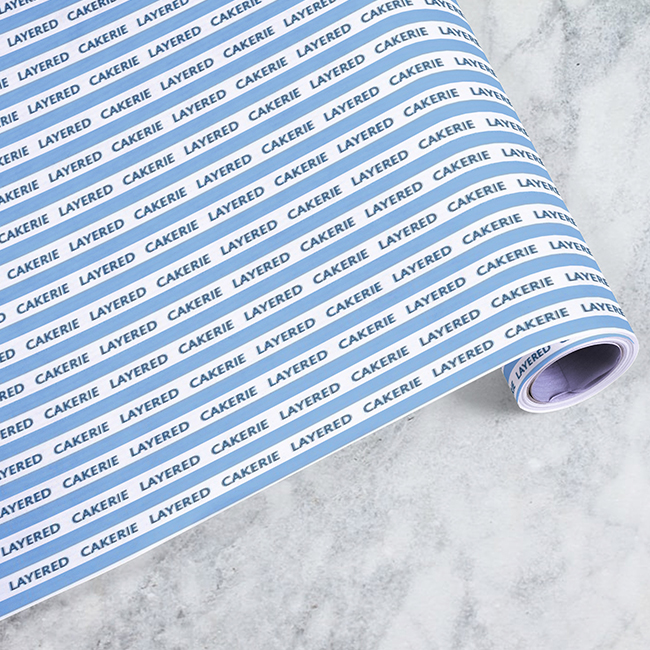
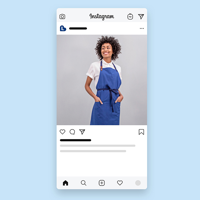
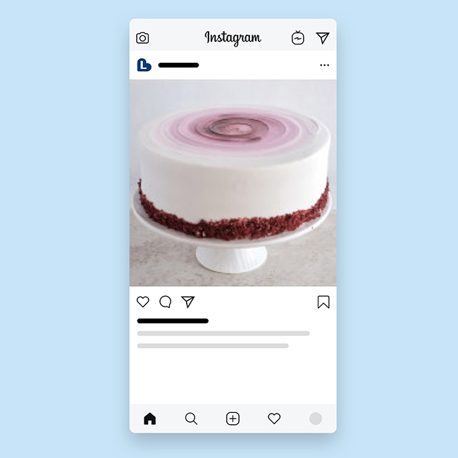
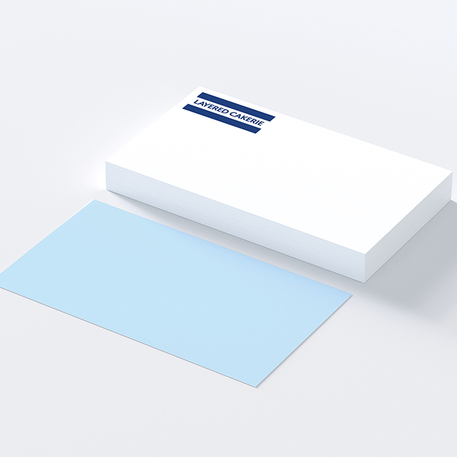
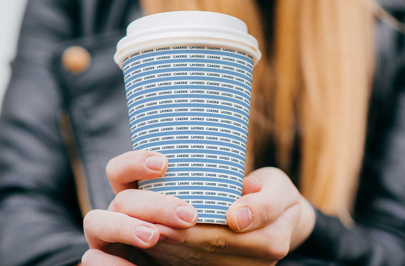
What: Layered Cakerie offers a unique collection of eleven elegant, giftable cakes—each thoughtfully handcrafted with natural, organic ingredients. Studio Usher was brought on at the very beginning to name the bakery as it transitioned from a bistro during Covid. From there, we developed the foundational branding and visual identity. The work included a logo, color palette, typography, packaging guidance, and tone of voice, all designed to reflect the bakery’s quality, presentation, and emotional connection to life’s everyday celebrations. The bakery’s bestselling cakes, ranging from Horchata to Chocolate Amore to a classic Chinese-style strawberry chiffon, reflect a quietly confident blend of flavor traditions that feel familiar, celebratory, and distinctly, well, Layered.
Goal: To create branding for a gourmet bakery that would appeal to a modern, style-conscious customer—someone who values quality, consistency, and reputation over price. The identity needed to feel elevated and timeless, with a recognizable visual system that would stand out in the bakery and food gifting space. The client described the aspiration clearly: “I don’t want to be trendy—I want to be timeless. I want people to recognize the box and say, ‘damn, this person must really like me.’”
Studio Usher set out to translate that vision into a visual language that conveys elegance, trust, and a sense of special occasion, without ever feeling exclusive or out of reach. We aimed to support Layered Cakerie’s long-term vision as a trusted food brand that customers turn to for beautifully presented, high-quality cakes that mark life’s moments.